
[and why we should stop teaching it in schools]
You will find images like the one above, that show that red, yellow and blue are the primaries and that yellow and blue make green.

So some people say yellow and blue make green. And you will find other answers that say that yellow and blue make black. How can this be?
Well, we need to understand a little science to get to the bottom of this.
The figure below shows what happens when you mix an ideal yellow dye with an ideal blue dye. The blue dye reflects light perfectly in about a third of the spectrum (and absorbs perfectly in the other two thirds). The yellow pigment reflects light perfectly in about two thirds of the spectrum (and absorbs perfectly in the other third).

The problem here is that the blue and yellow pigments (between them) absorb perfectly across the whole spectrum. The people who say that yellow and blue make black are saying so because of this argument.
Note that blue is a particularly bad choice of primary because it absorbs so broadly across the spectrum. [Making the blue even purer would only make the problem worse by the way.] Yellow is a good choice of subtractive primary because it only absorbs in one third of the spectrum.
The problem is, the people who say that blue and yellow make black are wrong of course. Every child knows this. In practice, if we measure the reflectance spectra for blue and yellow pigments they don’t look like those ideal ones I showed above. For a start, they are quite smooth. Here is a reflectance spectrum for a real yellow pigment. (The reflectance factor, by the way, is the proportion – or per cent – of light that the colorant reflects at each wavelength.)

Notice that with a real yellow colorant, it does not reflect perfectly in the middle and long wavelengths and it does not absorb perfectly in the short wavelengths. It reflects and absorbs to some extent all the wavelengths but it absorbs more at the shorter wavelength and absorbs at less the middle and longer wavelengths. The same is true of a real blue colorant; it does not absorb perfectly at the middle and longer wavelengths. The consequence of this is that you don’t get black if you mix blue and yellow. You would get black if the pigments were ideal but they are not. We live in the real world. However, you certainly don’t get a lovely bright green as shown in the colour wheel with red, yellow and blue primaries. You would get a dark desaturated murky dirty greenish colour. The main reason for this is that the blue is absorbing too broadly. Interestingly, if you look at the artist John Lovett’s page he explains that to mix a yellow and blue you should use a yellowish blue (and a bluish yellow).
Now let’s see what happens when we mix cyan and yellow dyes. We’ll start with the ideal colours.

It’s very nice. We get a lovely green colour. Cyan is a great subtractive primary because unlike blue it absorbs in only one third of the spectrum (the red or long wavelengths). Note that it is precisely because the cyan does not look pure that makes it a great primary – that’s why I get so furious about people saying the primaries are pure colours. The cyan looks bluish-green because it reflects in two thirds of the spectrum and only absorbs in the reddish part. Neither the cyan nor the yellow dye absorb in the middle (green) part of the spectrum and therefore the result of mixing cyan and yellow is a lovely green. Except it is not quite true. Remember, this is for ideal pigments. Real dyes do not look like that. Refer back to the measured reflectance spectrum for the real yellow pigment. In reality cyan and yellow do make green but the green might be a little less saturated than you may wish for because of the unwanted absorptions by the two dyes in the areas of the spectrum where ideally they would not absorb. (It was the great Robert Hunt, who worked for many years at Kodak – for those who knew him – who taught me about unwanted absorptions.)
Have you ever seen this happen. Of course, you have. Whenever you use a printer (which typically uses cyan, magenta and yellow primaries) to get a green, the printer is using cyan and yellow to make the green.
Remember those people who say that you can’t make blue because – yawn – it’s a pure colour that can’t be made by mixture? Well, have you ever printed out blue on a printer? Of course, you have. Let’s look again at our ideal primaries and see if we can explain it.
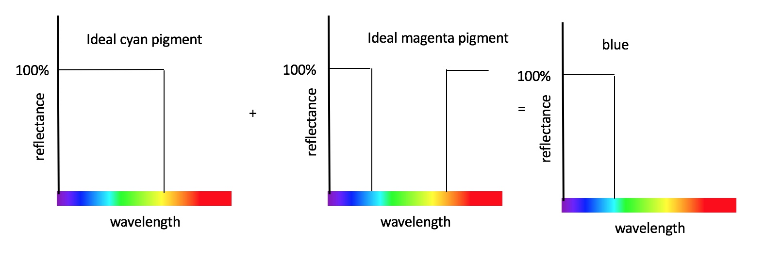
That’s right. Mixing cyan and magenta makes blue. The cyan absorbs in one third (the red third) and the magenta absorbs in one third (the green third) but neither absorb the short wavelengths.
John Lovett explains that you can do a decent job of mixing red, yellow and blue dyes, but only if you allow yourself to use multiple blues and multiple yellows, for example. If you want to do the best job possible using only three subtractive primaries, then the best you can do is to use cyan, magenta and yellow.
So finally you can see that the best subtractive primaries are cyan, magenta and yellow because the cyan is red absorbing, the magenta is green absorbing and the yellow is blue absorbing. And what is more, you now understand why this is the case (rather than accepting dogma). You also understand why there is a relationship between the CMY of subtractive mixing and the RGB of additive mixing.

The optimal additive primaries are red, green and blue (I will cover this elsewhere). And for this reason the optimal subtractive primaries are cyan (red absorbing), magenta (green absorbing) and yellow (blue absorbing).
But don’t be fooled by this lovely subtractive colour mixing diagram. You might not get such lovely blue, green and red colours when you mix real CMY primaries (either on your printer or with inks/paints). Why not? Because of the unwanted absorptions.
If you want to to know more you could do worse that get a copy of Measuring Colour, now in it’s 4th edition, and authored by Hunt and Pointer.
This post gets quite a few hits so I will take this opportunity to direct you to my short series of youtube clips that describe the issues discussed in this post in a visual way. You can see them here. If you want something a bit more technical check out this short lecture on colour primaries or visit my patreon.

This article focuses on pigments, and why CMY make more logical primaries for pigments. The explanation is solid (as any press printer will tell you!), and the RYB wheel as something taught in elementary school art class really does need to be updated. If we can get these guys to do a video on CMY, it would go a long way: https://www.youtube.com/watch?v=yu44JRTIxSQ
As a color scientist who straddles the worlds of image capture (RGB!) and print (CMYK and more!), however, we should absolutely continue to teach that yellow and blue make green, but make it clear that this works for light, and not so well for paint. I recall that Kodak did dabble in CMY color filters for a digital camera, but RGB filters (Bayer filter in particular) for light really do seem to have won the day for camera capture (with some interesting experiments in adding an “emerald” fourth pixel color by Sony that never quite seemed to take off).
@ John R Reinert Nash- I didn’t quite understand why you said that we should still teach that yellow and blue make green?
I agree Elizabeth. With light, yellow and blue makes white (or light grey).
Because kids aren’t learning to mix paints, they’re learning about how light works in science class, in which case yellow and blue indeed make green.
I assume he meant that if you tell teach them wrong information, possibly they will search for it and then learn it by themselves. It might also help them make them independent. I am not sure.
Hope this helped! 🙂
But yellow and blue light mixed uo don’t make green, it makes a bluish white (it’s like mixing two parts of blue light, one part of red light, and one of green light). Green forms when you mix together cyan and yellow paint or ink, with light, you would just need pure green light.
Ok seriously, yellow and blue make green. Full stop. How? because when I mix yellow and blue, it gives me a colour that I associate with a leaf, that’s why. All theory of additive and subtractive mixing aside, this is the real world, with real pigments where blue reflects a bit of green and yellow a bit of green and so blue + yellow = green. Opinionated posts regarding paint mixing should seriously only be formed after mixing the paints yourself.
Because kids aren’t learning to mix paints, they’re learning about how light works in science class, in which case yellow and blue indeed make green.
Painters have at their disposal many single pigment blues and quite a lot of different yellows. What green you end up with depending which blues you mix with which yellow you. A lemon yellow + a cerulean blue will make an acidic limey green, while a deep cadmium yellow and a prussian blue will make a dark bottle green. You can add some red (or pink) and make a much muddier green too. The possibilities are endless. I don’t know if what you are saying applies to screens and digital work or printing but it doesn’t make sense to a painter.
This post is good if we want to update color theory teaching at the elementary level, but the post doesn’t really address color gamuts, which is the real issue that artists face when needing to understand color theory, and the reason it is important to have more than three primary colors.