The Over The Rainbow team discuss the colour yellow. Yellow Ochre was one of the earliest pigments used by mankind. Orpiment was also widely used in antiquity despite it being based on arsenic and being poisonous. Yellow has also long been an important colour culturally. The Greeks – starting from Empedocles – believed that the world considered of four elements; each of the elements was associated with a colour. Yellow (or a yellow-green colour) was associated with earth; white with air, black with water and red with fire. This tetradic thinking about 4 special colours continued until the 14th or 15th Century; the idea of three special colours is a relatively recent idea. Yellow is probably the least favourite colour and invokes quite different reactions in different people. It is, perhaps, the marmite of colours.
Category Archives: opinions/rants
Red and Green make Yellow

Episode 4 of our colour podcast has just gone live. You can listen to it here.
Colour on Instagram
Recently I had the idea of trying to teach the basics of colour theory using Instagram.

The idea is to keep the messages really clear and simple and combine them with colourful imagery.

You can see this on my Instagram account @colourchat.
I was inspired to do this after watching what GothamChess was doing on Instagram to teach some simple – and not so simple – ideas about chess. Who would have thought it? From chess theory to colour theory.
Colour Podcast
I started a podcast all about colour. It’s mainly for fun – and as an educational resource – but I hope you find it interesting. You can see the podcast here. Please take a listen and if you like it please think about liking it or sharing it.
Why yellow and blue don’t make green

[and why we should stop teaching it in schools]
You will find images like the one above, that show that red, yellow and blue are the primaries and that yellow and blue make green.
Sometimes this is represented as a colour wheel:

So some people say yellow and blue make green. And you will find other answers that say that yellow and blue make black. How can this be?
Well, we need to understand a little science to get to the bottom of this.
The figure below shows what happens when you mix an ideal yellow dye with an ideal blue dye. The blue dye reflects light perfectly in about a third of the spectrum (and absorbs perfectly in the other two thirds). The yellow pigment reflects light perfectly in about two thirds of the spectrum (and absorbs perfectly in the other third).

The problem here is that the blue and yellow pigments (between them) absorb perfectly across the whole spectrum. The people who say that yellow and blue make black are saying so because of this argument.
Note that blue is a particularly bad choice of primary because it absorbs so broadly across the spectrum. [Making the blue even purer would only make the problem worse by the way.] Yellow is a good choice of subtractive primary because it only absorbs in one third of the spectrum.
The problem is, the people who say that blue and yellow make black are wrong of course. Every child knows this. In practice, if we measure the reflectance spectra for blue and yellow pigments they don’t look like those ideal ones I showed above. For a start, they are quite smooth. Here is a reflectance spectrum for a real yellow pigment. (The reflectance factor, by the way, is the proportion – or per cent – of light that the colorant reflects at each wavelength.)

Notice that with a real yellow colorant, it does not reflect perfectly in the middle and long wavelengths and it does not absorb perfectly in the short wavelengths. It reflects and absorbs to some extent all the wavelengths but it absorbs more at the shorter wavelength and absorbs at less the middle and longer wavelengths. The same is true of a real blue colorant; it does not absorb perfectly at the middle and longer wavelengths. The consequence of this is that you don’t get black if you mix blue and yellow. You would get black if the pigments were ideal but they are not. We live in the real world. However, you certainly don’t get a lovely bright green as shown in the colour wheel with red, yellow and blue primaries. You would get a dark desaturated murky dirty greenish colour. The main reason for this is that the blue is absorbing too broadly. Interestingly, if you look at the artist John Lovett’s page he explains that to mix a yellow and blue you should use a yellowish blue (and a bluish yellow).
Now let’s see what happens when we mix cyan and yellow dyes. We’ll start with the ideal colours.

It’s very nice. We get a lovely green colour. Cyan is a great subtractive primary because unlike blue it absorbs in only one third of the spectrum (the red or long wavelengths). Note that it is precisely because the cyan does not look pure that makes it a great primary – that’s why I get so furious about people saying the primaries are pure colours. The cyan looks bluish-green because it reflects in two thirds of the spectrum and only absorbs in the reddish part. Neither the cyan nor the yellow dye absorb in the middle (green) part of the spectrum and therefore the result of mixing cyan and yellow is a lovely green. Except it is not quite true. Remember, this is for ideal pigments. Real dyes do not look like that. Refer back to the measured reflectance spectrum for the real yellow pigment. In reality cyan and yellow do make green but the green might be a little less saturated than you may wish for because of the unwanted absorptions by the two dyes in the areas of the spectrum where ideally they would not absorb. (It was the great Robert Hunt, who worked for many years at Kodak – for those who knew him – who taught me about unwanted absorptions.)
Have you ever seen this happen. Of course, you have. Whenever you use a printer (which typically uses cyan, magenta and yellow primaries) to get a green, the printer is using cyan and yellow to make the green.
Remember those people who say that you can’t make blue because – yawn – it’s a pure colour that can’t be made by mixture? Well, have you ever printed out blue on a printer? Of course, you have. Let’s look again at our ideal primaries and see if we can explain it.
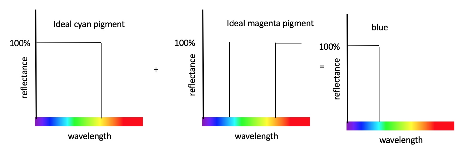
That’s right. Mixing cyan and magenta makes blue. The cyan absorbs in one third (the red third) and the magenta absorbs in one third (the green third) but neither absorb the short wavelengths.
John Lovett explains that you can do a decent job of mixing red, yellow and blue dyes, but only if you allow yourself to use multiple blues and multiple yellows, for example. If you want to do the best job possible using only three subtractive primaries, then the best you can do is to use cyan, magenta and yellow.
So finally you can see that the best subtractive primaries are cyan, magenta and yellow because the cyan is red absorbing, the magenta is green absorbing and the yellow is blue absorbing. And what is more, you now understand why this is the case (rather than accepting dogma). You also understand why there is a relationship between the CMY of subtractive mixing and the RGB of additive mixing.

The optimal additive primaries are red, green and blue (I will cover this elsewhere). And for this reason the optimal subtractive primaries are cyan (red absorbing), magenta (green absorbing) and yellow (blue absorbing).
But don’t be fooled by this lovely subtractive colour mixing diagram. You might not get such lovely blue, green and red colours when you mix real CMY primaries (either on your printer or with inks/paints). Why not? Because of the unwanted absorptions.
If you want to to know more you could do worse that get a copy of Measuring Colour, now in it’s 4th edition, and authored by Hunt and Pointer.
This post gets quite a few hits so I will take this opportunity to direct you to my short series of youtube clips that describe the issues discussed in this post in a visual way. You can see them here. If you want something a bit more technical check out this short lecture on colour primaries or visit my patreon.

Why the ‘three colour primaries’ rule is wrong
 A great many textbooks state that there are three colour primaries. This is normally followed by the statements:
- All colours can be made by mixing together three primaries.
- The primaries – which are often cited as being red, yellow and blue – are pure and cannot be created from mixture.
Not only do I profoundly disagree with these last two statements but I disagree with the statement that there are three colour primaries. Here’s why:
It is relatively easy to go into a lab or studio, start with three colours (any three; you pick’em) and find that you cannot make all colours. People who do this will often say, that theoretically you can make all colours from, say, red, yellow and blue but that practically you can’t simply because the primaries are not pure enough. The problem is, the more pure you make the primaries, the fewer colours you can make!! The fact is you cannot make all colours from three primaries no matter how carefully you choose the primaries. You cannot do it practically and you cannot do it theoretically.
We can trace the idea that primaries are ‘pure’ back to ancient Greece. In those times and for centuries afterwards it was even frowned upon to mix colours at all because of the loss of purity.
It turns out that if you want to make a large range of colours using three inks or paints, the primaries you should choose are cyan, magenta and yellow. Don’t just take my word for it. Go and ask HP, Canon or Xerox. These companies have made printers for decades and make a living out of selling devices that allow consumers to make a wide range of colours with just three primary inks. They all use cyan, magenta and yellow as their primaries.
But how can magenta be a primary you might ask? It’s far from pure. That is because the notion of primaries being pure is an outdated idea (outdated for several centuries I might add) and should not be taught in Schools. Cyan, magenta and yellow make good primaries for an ink system precisely because they are not visually pure – they each absorb in a narrow part of the visible spectrum and therefore emit light quite broadly. Blue would make a poor primary in an ink or paint system because it absorbs at too many wavelengths. Mixing together blue and red inks make a very dirty brownish black colour. So the gamut (the technical term for a range of colours produced by some primaries) of colours we can make from red, yellow and blue inks or paints is quite small.
So, we can’t make all colours from three primaries, the best primaries are not those that are pure, and primaries can be made by mixing other colours. It is easy to show that a blue can be made by mixing together cyan and magenta inks and this is shown rather nicely by the artist Scott Naismith in this very nice youtube video.
We tend to use three primaries in many systems because you can make a great many more colours with two primaries than with one and you can make a great many more colours with three primaries than you can with two. But you can’t make all colours with three. You can make more colours (a larger gamut) with four or five primaries – though you still can’t make them all – but we reach the point of diminishing returns. Is it worth the extra expense of having four or five primaries if three do a pretty good job? Usually not. However, sometimes we do think it is worth using more than three primaries. For a start, most printers use CMYK (cyan, magenta, yellow and black) so that is four primaries. Then we have hexachrome printing systems with six primaries. The Quattron TV is manufactured by Sharp and has four primaries (red, green, blue and yellow) whereas most TVs only have three (red, green and blue).
The truth is there is no perfect set of primaries and there is no fixed number. A set of primaries is simply a set of colours in a colour system that can make a useful range of colours (gamut). Very often three hits the commercial soft spot but that’s just about engineering and economics.
For further information list to my podcast about colour

Or visit my patreon page at https://www.patreon.com/colourchat

accurate colour on a smartphone or tablet
Electronic displays can vary in their characteristics. Although almost all are based on RGB, in fact the RGB primaries in the display can vary greatly from one manufacturer to another. Colour management is the process of making adjustments to an image so that colour fidelity will be preserved. In conventional displays – desktops and laptops – the way this is achieved is through ICC colour profiles. Colour profiles store information about the colours on a particular device that are produced by RGB values on that device. So to make a display profile you normally need to display some colours on the screen and measure the CIE XYZ values of those colours; you then have the RGB values you used and the XYZ values that resulted. The profiling software can use these corresponding RGB and XYZ values to build a colour profile so that the colour management engine knows how to adjust the RGB values of an image so that the colours are displayed properly. Building a profile often requires specialist colour measurement equipment – though this can often be quite inexpensive now. If you are using your desktop or laptop display and you have never built a profile then you are probably using the default profile that was provided when your display was shipped. The default profile will ensure some level of colour fidelity but particular settings (such as the colour temperature or the gamma) may not be adequately accounted for. If you want accurate colour then you should learn about colour profiling.
It all sounds simple except for the fact that ICC colour profiles are not supported by iOS or Android operating systems on mobile devices. I find this really surprising but that’s how it is for now. Maybe it will be different in the future.
This means that ensuring colour fidelity on a smartphone or tablet is not so straight forward. So what can you do?
Well, there are two commercial solutions to this problem that I am aware of. They are X-rite’s ColorTrue and Datacolor’s SpyderGallery. ColorTrue and SpyderGallery are apps that will use a colour profile and provide good colour fidelity. These are great solutions. Perhaps the only drawback is that the colour correction only applies to images that are viewed from within the app. Having said that, they allow your standard photo album photos to be accessed – but the correction would not apply, for example, to images viewed using your web browser. This is why a proper system implemented at the level of the operating system would be better, in my opinion.
There are two alternatives. The first would be to implement your own colour correction and modify the images offline before sending them to the device. This would not suit everyone – the average consumer who just wanted to look at their photos for example. But it is what I typically do here in the lab if I want to display some accurate colour images on a tablet. But if you were a company and you wanted to display images of some products for example – it might be a reasonable approach. It has the advantage that the colour correction will work when viewed in any app on the device because the colour correction has been applied at the image level rather than the app level. But it does mean you need to do this separately for each device and keep track of which images are paired to each device. This is ok if you have one or a small number of devices but maybe not so good if you have hundreds of devices.
The second alternative would be to build your own app. If you want to do things with your images that you cannot do in ColorTrue or SpyderGallery or if you have lots of devices and you can’t be bothered to manually convert the images for each device, then you could install your own app that implements a colour profile and then does whatever else you want it to do.
how colour vision works

Really super article by Ana Swanson in the Washington Post about colour vision and how it works. As she explains, it is not really correct to think of the long wavelength visible light as being red. It is better, as Newton knew of course, to say that the long-wavelength light has the ability to cause the sensation of redness in us. She gives a nice visual example of how the spectrum looks to a dog, something (by coincidence) that I was only talking about in a lecture last week. As she says:
Is what I see as “blue” really the same thing as what you see as “blue”? Or have we both learned the same name for something that looks different to each of us?
Her article is really worth reading.
There is just one thing I take issue with. It may be ‘nit picking’. But she says “A green leaf, for example, reflects green wavelengths of light and absorbs everything else.”
My image, at the top of this post, shows the reflectance of a typical yellow object. At each wavelength the reflectance is between 0 and 100 per cent. But notice that it is not zero at any wavelength in the range shown (400-700nm). That means that the object reflects light at every wavelength. And it is not 100 at any wavelength meaning that it also absorbs to some extent at every wavelength. It’s just it absorbs more at the shorter wavelengths than at the longer wavelengths and it reflects more at the longer wavelengths than at the shorter ones. But notice one other remarkable thing – the yellow object reflects more light at 700nm (a wavelength we would normally associate with red) than it does at 580nm (a wavelength we might normally associate with yellow).
Yes, the reflected light does look yellow. But, the notion that a “A yellows object reflects yellow wavelengths of light” is misleading. It suggests that the yellow object only reflects, for example, the wavelengths in the spectrum we would normally think of as yellow (around 580nm) and absorbs the rest. This is just not how things are.
What colour is your office?

I just saw an interesting article by Kim Lachance Shandrow about how the colour of your office can affect productivity. The article refers to a paper (2007) in Color Research and Application (CRA) by Nancy Kwallek entitled Work week productivity, visual complexity, and individual environmental sensitivity in three offices of different color interiors. The paper suggests that the influences of interior colours on worker productivity were dependent upon individuals’ stimulus screening ability and time of exposure to the interior colours. CRA is a top quality academic journal that is peer reviewed and so I am respectful of the findings.
However, in Kim’s online article there is a lot of stuff that I am highly sceptical about. For example, she writes that “Red … increases the heart rate and blood flow upon sight.” Is this true? Is there really any evidence for this. I have two PhD students working in this area right now and I am far from sure that colour does affect heart rate and, if it does, the effects are probably tiny. And yet we can read statements like this all over the internet as if it is a fact beyond doubt. Other things she says that I take with a pinch of salt is that “green does not cause eye fatigue” and that “yellow triggers innovation.” Don’t get me wrong – I am very interested in how colour can be used to affect us emotionally, psychologically and behaviourally; it’s just there is a danger that if some things are said often enough (such as red increases your blood pressure or heart rate) then people start believing them even though there may be little evidence.
That said, you might find the infographic fun and it is well done. See the original and full article here.
Extraordinary facts relating to the vision of colours
In 1794 John Dalton presented a lecture to the Manchester Literary and Philosophical Society about colour vision. The first two sentences are shown below:
It has been observed, that our ideas of colours, sounds, tastes, etc. excited by the same object may be very different in themselves, without our being aware of it; and that we may nevertheless converse intelligibly concerning such objects, as if we were certain the impressions made by them on our minds were exactly similar. All, indeed, that is required for this purpose, is, that the same object should uniformly make the same impression on each mind; and that objects that appear different to one should be equally so to others.
It is interesting to reread this sentence again in the light of the recent controversy about the blue and black dress.
