
Episode 4 of our colour podcast has just gone live. You can listen to it here.
Episode 4 of our colour podcast has just gone live. You can listen to it here.

[and why we should stop teaching it in schools]
You will find images like the one above, that show that red, yellow and blue are the primaries and that yellow and blue make green.

So some people say yellow and blue make green. And you will find other answers that say that yellow and blue make black. How can this be?
Well, we need to understand a little science to get to the bottom of this.
The figure below shows what happens when you mix an ideal yellow dye with an ideal blue dye. The blue dye reflects light perfectly in about a third of the spectrum (and absorbs perfectly in the other two thirds). The yellow pigment reflects light perfectly in about two thirds of the spectrum (and absorbs perfectly in the other third).

The problem here is that the blue and yellow pigments (between them) absorb perfectly across the whole spectrum. The people who say that yellow and blue make black are saying so because of this argument.
Note that blue is a particularly bad choice of primary because it absorbs so broadly across the spectrum. [Making the blue even purer would only make the problem worse by the way.] Yellow is a good choice of subtractive primary because it only absorbs in one third of the spectrum.
The problem is, the people who say that blue and yellow make black are wrong of course. Every child knows this. In practice, if we measure the reflectance spectra for blue and yellow pigments they don’t look like those ideal ones I showed above. For a start, they are quite smooth. Here is a reflectance spectrum for a real yellow pigment. (The reflectance factor, by the way, is the proportion – or per cent – of light that the colorant reflects at each wavelength.)

Notice that with a real yellow colorant, it does not reflect perfectly in the middle and long wavelengths and it does not absorb perfectly in the short wavelengths. It reflects and absorbs to some extent all the wavelengths but it absorbs more at the shorter wavelength and absorbs at less the middle and longer wavelengths. The same is true of a real blue colorant; it does not absorb perfectly at the middle and longer wavelengths. The consequence of this is that you don’t get black if you mix blue and yellow. You would get black if the pigments were ideal but they are not. We live in the real world. However, you certainly don’t get a lovely bright green as shown in the colour wheel with red, yellow and blue primaries. You would get a dark desaturated murky dirty greenish colour. The main reason for this is that the blue is absorbing too broadly. Interestingly, if you look at the artist John Lovett’s page he explains that to mix a yellow and blue you should use a yellowish blue (and a bluish yellow).
Now let’s see what happens when we mix cyan and yellow dyes. We’ll start with the ideal colours.

It’s very nice. We get a lovely green colour. Cyan is a great subtractive primary because unlike blue it absorbs in only one third of the spectrum (the red or long wavelengths). Note that it is precisely because the cyan does not look pure that makes it a great primary – that’s why I get so furious about people saying the primaries are pure colours. The cyan looks bluish-green because it reflects in two thirds of the spectrum and only absorbs in the reddish part. Neither the cyan nor the yellow dye absorb in the middle (green) part of the spectrum and therefore the result of mixing cyan and yellow is a lovely green. Except it is not quite true. Remember, this is for ideal pigments. Real dyes do not look like that. Refer back to the measured reflectance spectrum for the real yellow pigment. In reality cyan and yellow do make green but the green might be a little less saturated than you may wish for because of the unwanted absorptions by the two dyes in the areas of the spectrum where ideally they would not absorb. (It was the great Robert Hunt, who worked for many years at Kodak – for those who knew him – who taught me about unwanted absorptions.)
Have you ever seen this happen. Of course, you have. Whenever you use a printer (which typically uses cyan, magenta and yellow primaries) to get a green, the printer is using cyan and yellow to make the green.
Remember those people who say that you can’t make blue because – yawn – it’s a pure colour that can’t be made by mixture? Well, have you ever printed out blue on a printer? Of course, you have. Let’s look again at our ideal primaries and see if we can explain it.
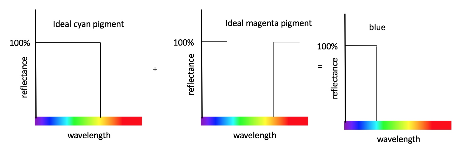
That’s right. Mixing cyan and magenta makes blue. The cyan absorbs in one third (the red third) and the magenta absorbs in one third (the green third) but neither absorb the short wavelengths.
John Lovett explains that you can do a decent job of mixing red, yellow and blue dyes, but only if you allow yourself to use multiple blues and multiple yellows, for example. If you want to do the best job possible using only three subtractive primaries, then the best you can do is to use cyan, magenta and yellow.
So finally you can see that the best subtractive primaries are cyan, magenta and yellow because the cyan is red absorbing, the magenta is green absorbing and the yellow is blue absorbing. And what is more, you now understand why this is the case (rather than accepting dogma). You also understand why there is a relationship between the CMY of subtractive mixing and the RGB of additive mixing.

The optimal additive primaries are red, green and blue (I will cover this elsewhere). And for this reason the optimal subtractive primaries are cyan (red absorbing), magenta (green absorbing) and yellow (blue absorbing).
But don’t be fooled by this lovely subtractive colour mixing diagram. You might not get such lovely blue, green and red colours when you mix real CMY primaries (either on your printer or with inks/paints). Why not? Because of the unwanted absorptions.
If you want to to know more you could do worse that get a copy of Measuring Colour, now in it’s 4th edition, and authored by Hunt and Pointer.
This post gets quite a few hits so I will take this opportunity to direct you to my short series of youtube clips that describe the issues discussed in this post in a visual way. You can see them here. If you want something a bit more technical check out this short lecture on colour primaries or visit my patreon.

Imagine that we have three projection lamps at the back of a hall – one has a red filter and so produces a beam of red light, and the other two use filters to produce green and blue beams. We project these onto a white screen and get three circles of light (one, red, one green and one blue). We then move the angles of the projectors so that the circles of light overlap. We get something that looks rather like this:

Where the red and green light overlap we get yellow. We get magenta and cyan for the other two binary mixtures. So,
red + green = yellow
red + blue = magenta
green + blue = cyan
This is called additive colour mixing as I am sure you know. And if we mix all three primaries we can achieve white (or other neutral colours). The primaries could be single wavelengths of light – so we could use a primary at, say, 700 nm (for the red) and one at 450 nm (blue) and one at 530 nm (green). So green light (530 nm) and red light (700 nm) additively mix together and generate yellow. When this happens what is being mixed and where does this mixing take place? Take a few moments to consider this before reading on.
Notice I said that they additively mix to generate yellow – I specifically avoided saying that they mix to generate yellow light. When I sat down with a couple of students last week and asked then what they though they said that the red and green light mixed together to create yellow light and when I pressed them, they went further to say that the yellow light was at about 575 nm.

If we measure the part of the screen that is yellow we would see that we have some light at 700 nm and some at 530 nm. The wavelengths are not mixed; they don’t mix together to generate some third wavelength of light such as 575 nm. So no physical mixing takes place other than – I suppose one could argue – that the red and green lights are mixed in the sense that they are spatially coincident. But that’s not really mixing, for me, and certainly doesn’t even begin to explain why we have the sensation of yellow when we look at these wavelengths together. It also makes me think that additive colour mixing, if it can be said to occur anywhere in particular, occurs in the eye. And I do mean eye, not brain.
In a previous post I spoke about the difference between additive and subtractive mixing and why the additive primaries are red, green and blue or RGB for short – http://colourware.wordpress.com/2009/07/13/additive-colour-mixing/
The chromaticity diagram – see http://colourware.wordpress.com/2009/09/28/colourchat-audiovisual-guide-to-the-chromaticity-diagram/ – has a very useful property. If you plot the chromaticities of two lights, then the straight line that joins the two points on the chromaticity diagram show you the additive mixtures that can be obtained by mixing together the two lights. If we take three lights, then the additive mixtures that can be obtained are defined by the triangle that is formed if the chromaticities are the vertices of the triangle. Ok – that’s a bit of a mouthful so let’s have a practical example. The triangle in the diagram below shows the gamut that can be achieved when we have three additive primaries that are positioned at the corners of the triangle.

From this diagram it should become obvious why the additive primaries are RGB. Say, we chose, two reds and a cyan as the three additive primaries – well, the triangle would be tiny. In other words, the gamut would not be very big. The biggest triangle in the chromaticity is one whose vertices are formed by a red, a green and a blue. WhichRGB will give the biggest triangle? I don’t know – it’s been something that has been puzzling me for the last few days and I’ll come back to this in a later post. But certainly any RGB triangle is pretty large as long as the red, green and blue primaries chosen are reasonably saturated.
So what happens if we choose RGB as the subtractive primaries? Subtractive colour mixing describes how inks and paints mix together to form colours. The first thing to point out is that subtractive colour mixing is not additive and linear – you remember I said that when you mix two lights together the colour mixtures all fall on the straight line that joins the two points in the chromaticity diagram that represent the two lights? Well, this is only true for additive colour mixing. So to work out the gamut for subtractive systems is not an easy thing to do. However, if you do select the three subtractive primaries as RGB you’ll get a gamut that looks something like this:

Notice that the gamut is concave. Mixing red and green lights produces a nice yellow. You can test this by going into your colour-picker in software such as Photoshop or Powerpoint and setting the RGB values to be 255:255:0. You’ll get a nice yellow. But mixing red and green paints – it will give you a similar hue to yellow but you’ll get something quite desaurated; most likely you’ll get a brown. So using RGB as the subtractive primaries would not be a very good thing at all.
It turns out that additive and subtractive colour mixing are very related. The best subtractive primaries are the ones that control the amount of red, green and blue light reflected. A yellow dye applied to textiles, for example, mainly absorbs short wavelengths in the blue section of the spectrum, allowing the other wavelengths to be reflected by the textile. The “other wavelengths” that are reflected give yellow. But the important point is that the yellow dye absorbs blue. Similarly, a magenta dye absorbs green and a cyan dye absorbs red. This leads to the idea of the optimal subtractive primaries being those that are cyan, magenta and yellow or CMY. This leads to a gamut somewhat like this:

The biggest gamut for subtractive mixing is obtained by using CMY as the primaries. But weren’t you taught at school that the subtractive primaries are red, blue and yellow? Almost certainly you were – and this is because it is accepted dogma at most art colleges and in many art and design textbooks. But it is quite easy to show that the optimal primaries – those giving the largest gamut – are CMY not RBY. If you were building a colour-reproduction system using only three colours such as a printer you would come to the conclusion – as companies such as HP, Xerox, and Epson have done – that you get the largest colour range with CMY. So why has it become commonplace for artists to refer to red, yellow and blue as the primaries? Could it be a colour naming and language issue – that they really mean cyan when they say blue and it’s just a naming error. Possible, but not likely in my opinion. I think it is more likely that most artists are not overly concerned that RYB gives a smaller gamut than CMY because they rarely restrict themselves to three primaries. An artist would typically use 6 or more primaries. For example, they might use two blues (one that is reddish and one that is greenish), two reds (one that is yellowish and one that is bluish) and two yellows (one that is greenish and one that is reddish) in order to easily be able to mix a wide range of colours. The (mis-)identification of RYB as the subtractive primaries has much to do with colour wheels. I like to keep each of these blog posts reasonably concise – if I start writing about the problems of colour wheels now I will be writing for another 2 hours. And it’s nearly midnight now so colour wheels will need to wait for another day!